So, this theme thing.
Grab a drink, this is a long one. After it resolves I’ll probably put a condensed version of this on my work blog, so if you’d rather wait a few weeks until then, move along!
The host of my online shop, Shopify, has themes. Kind of like WordPress has themes for blogs, only, Shopify has, like, 50, whereas WordPress has, like, thousands. And you can’t really get themes outside of Shopify without either paying through the nose for them (I was interested in one company but they don’t publish their rates, and finally made a veiled statement of “five figures” … to which I was like, HAHAHAHAH no) or risking that you’re getting an unsupported theme (more on that in a minute). Some Shopify themes are free, some cost between $150-200. Now, I don’t mind paying for something that’s good, something supported, something that does what I want. BUT. It seems that I’ve had bad theme luck.
On one hand, once you buy a theme/template, it’s yours forever (all of mine are still accessible in the back end of my shop, which is how I got these screenshots). But if it’s considered “old” (and I can’t quite make out what they think is “old” but it seems to be some sort of secret algorithm that has to do with number of sales over a period of time) then Shopify no longer supports it — that means that when they update their back end and make changes like adding social media buttons, or making themes responsive, they don’t add that functionality to the old themes. When a theme becomes unsupported, most designers will pull their themes from the Shopify store so they’re no longer for sale and/or findable (I don’t blame them, I wouldn’t want to be inundated with questions about “why doesn’t this do this” either.)
So. Let’s look at my theme life.
I don’t even recognize this theme. I think it’s the free theme that came with my initial Shopify start, which I immediately discarded and moved on to…
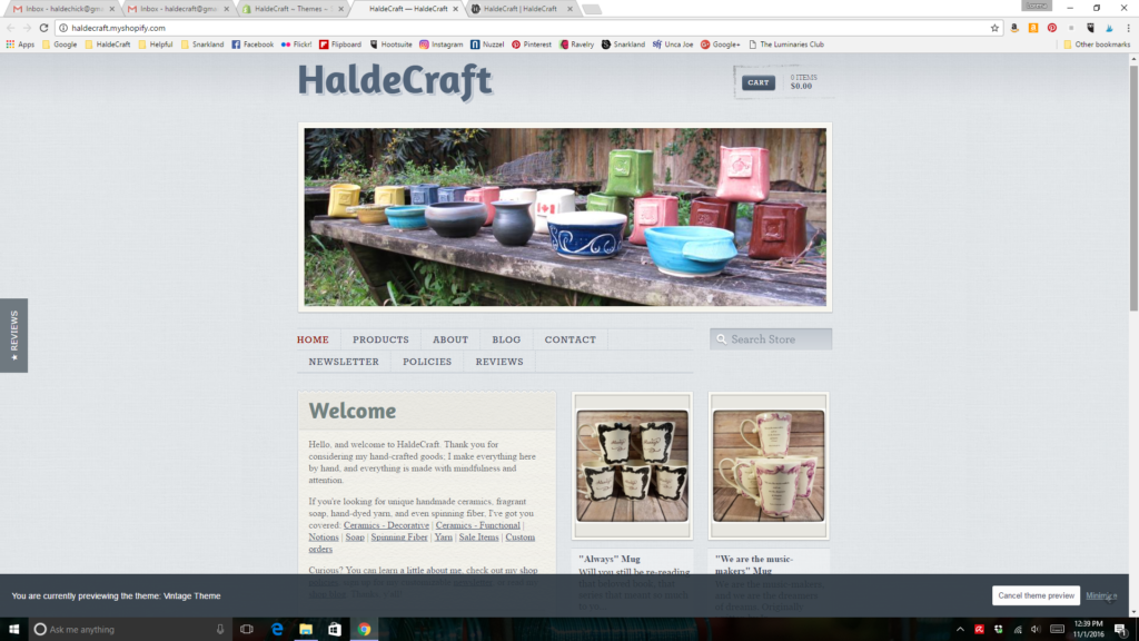
My favorite theme! I loved this one! I think I paid between $100-120 for it, and I think that was in early 2011. The frame around the banner picture? The way the banner picture doesn’t take up the top half of the entire website? The way the background kind of looks like graph paper? The list of collections on the sidebar? LOVED THIS ONE. But then social sharing buttons were added, and that theme wasn’t supported any more. (I think something else was added, too, but I don’t remember what, now… something about shipping?) So if I wanted automagic buttons on each listing to like things on Facebook or share on Pinterest (and whatever the other thing was), I had to upgrade. So I moved on to…
This was the only one I could find that was remotely like the one I liked (I think I paid about $100 for it – maybe $80, I seem to recall it was cheaper than the other one – I believe this was sometime in early to mid 2014 – I don’t remember exactly but when I contacted the designer – more on that in a minute – one of my points was that I’d had it less than a year). I didn’t really like this one, but I thought it was close enough to the one I did like that it wouldn’t be a big clash for people who were returning for maybe their second sale, and suddenly I look all different. One thing that drove me nuts about this one is that it wanted portrait photos, not square or landscape.
And there was some weird weirdness going on between my camera, Windows, this site, and Pinterest… photos I took in portrait with the camera looked sideways in the folder on Windows. But when I uploaded them they would be back in portrait on the website. But if someone saved it in Pinterest it would be sideways again – I felt it made me look like I didn’t know what I was doing, and coupled with this being the year I really started using Instagram, I started making my primary photos square. If I took them in portrait and cropped them with my phone they were fine. If I took them in landscape with my camera and cropped them square they were fine. If I took them in portrait with my camera and cropped them they were still jacked up. But this site really, really wanted landscape pictures as the first one, as you can see by the wonky frame around the mugs in the example above… and there was nowhere to be able to edit that. Sigh. But that soon wouldn’t matter!
Google got into the mix early last year (April of 2015) and they were going to start devaluing in searches, shops that weren’t responsive (that’s when things will change size but still look proportional to the screen, no matter if they’re on PC or phone or tablet). This theme was not responsive, and when I contacted the designer to find out were there any plans to make this responsive (there were not) and if not, could I get a partial refund since I’d had it less than a year (no I could not) and now I was going to have to buy a whole new one because I didn’t want to lose my Google ranking. So the week before we moved out here to the property I got this one…
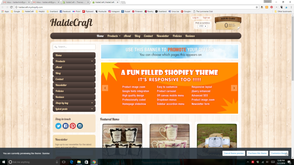
This is the one I have now. I think I paid $140 for it, and I didn’t really dig it but it was the cheeriest one I saw up there. But here’s what happened with this one — I bought it, I put it live, and then we moved. And then I didn’t have time to work on it for a couple of months. And then I broke my hand. And then it was Christmas. And by Spring, any thought of cleaning things up and fixing anything janky was like the song – gone, daddy, gone. Right out of my head.
Now they’re getting ready to roll out some new changes to supported themes and since my theme is no longer supported, I’m wondering… this yellow theme, while at least colorful, has always had some weirdness and I’m wondering if that weirdness is why online sales have dimmed since April of last year. Not that I’m not producing cool things, but that the theme is so hard to navigate, people just can’t find things? For example, if you hit the “products” button, you don’t get taken to a page of my categories… you get taken to a page listing all of my products alphabetically. But the “home” button has a dropdown that lists all of my categories. I mean, *I* find that shit annoying and it’s *my* site!
So maybe I should look for a new theme, after they finish rolling out these front page changes they’re making? But. ………
So many of the themes look exactly alike! You have your white background with your picture that takes up the top half of the website, and you have to scroll down to get to things for sale, all on white backgrounds so everything looks like it’s floating in mid-air. You have ones that are exactly the same, but with a black background (and white text, and if you have your own opinion about this I’m sure I’ll still like you but white text on a black background is an abomination of the Lord). Then you have ones that are kind of like the white ones, but with a border around the photo. To me, everything looks like it’s selling fashion or technology. Nothing looks homey. Nothing looks artistic, creative, individual. I literally can not tell one theme from the other when I’m scrolling through the page of them.
Another “but” is that the theme I’m using now – and this should surprise no-one… is no longer supported! Any future changes/fixes to the system won’t be available on the theme I’m using! So let’s at least look at other themes, shall we…?
Here is the only one with personality I could find, and if you sort the page by “popularity” this poor guy is nearly at the bottom. Do I want to pay $140 for another theme that most likely is not going to be supported soon…? But the wood background! It’s almost like the background in my lightbox! How could I not show it some love? That bright orange would have to go, though. Good lord.
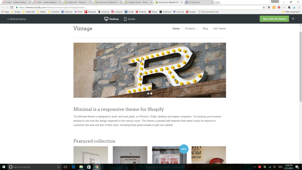
Lastly, this is their most popular theme. Did you fall asleep looking at it? I did. But it’s free. And the most popular theme they offer. So it has two advantages in that (a) it’s free and (b) it’s popular and not likely to disappear from support any time soon. It’s also boring as zzzzzzzzzzzzzzz Oh, sorry, I fell asleep again thinking about the theme.
I want a site that’s easily navigable. I want one that doesn’t bork up my photography but one that also doesn’t slap a picture on that’s the size of your monitor (I mean, I like my photography, but I’m not a freaking magazine…!). I’d love one with a menu on the sidebar but it doesn’t look like I have a lot of options for that. I want one that’s not an eyesore but still stands out, one that doesn’t look like every single other one that’s offered. Grr; argh.
I told you this was a long one!


Oh, but (not to make you read more, but…) here’s something I think I should think about. I don’t want any of the themes that look alike in part because they look too slick. I don’t think they make it look like I’m a one-person show. Why is that? I mean, not why are there no themes that are good for artists/craftspersons (although that’s a good question), but… why don’t I want to look that slick? Do I think it makes me look too … professional? Too… haughty? Too… standoffish? If it’s merely that I think it makes me look more professional/business-like… why does that turn me off? Why don’t I want to look professional? Maybe looking a bit more upscale might up my sales! So. Just something to think about. “Why am I resisting change”… other than, you know, it’s the holiday season and I’m busy and blah blah blah.
I’d probably take the boring free one and see how it works before shelling out for any of these other ones that don’t seem at all satisfactory.